More prominence for users Dataprix
- Read more about More prominence for users Dataprix
- Log in to post comments
We want to give more importance to our users, and better distinguish the personal profiles of the corporate community, in order to enhance each in his way.
When someone registers Dataprix, by default you get a personal profile that has its own blog, and you can open topics in the forum, comment on any content, update status, subscribe to content or communicate with others in the comunity , among other things.
If it is a company that wants to share content more corporate types, such as press releases, product information, success stories, events, etc. us has to seek and attach to your user profile so you can now also publish such content.
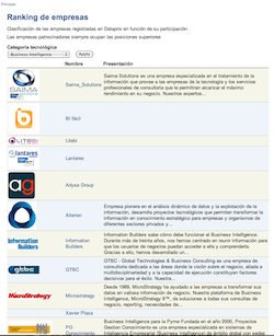
The novelty is that we have split this ranking in two ..


 We have modified the email subscription system to Dataprix content.
 As many have noticed, we changed Dataprix logo.